“Dear Louise: A Tribute to Louise Fishman”
Cheim & Read, New York City, May 18–June 30, 2023
by Paul Moreno
Louise Fishman, born in 1939, passed away in the summer of 2021. Cheim & Read, who had a decades long relationship with the artist, mounted a beautiful exhibition of her paintings this past summer which was a bittersweet joy to see. I should share here that I really began my own career in the arts at Cheim & Read in 1998 as the front desk attendant. One of the first shows that I was at the gallery for was Fishman’s 1998 exhibition there. I remember the first day she walked in with her small dog. She wore jeans and a plaid shirt; she was warm and charming and an immediate delight. I must also admit I was not at all familiar with her work but when I saw it, it changed my eye. And in the various times I would encounter her over the years, I would be touched by her wisdom, her desire to find meaning in the world, and her impulse to imbue meaning into her painting.
Though her work contains all the trademarks of Abstract Expressionism, I think it is far too simple to limit her work by calling it late AbEx, as it sometimes has been. In particular, if AbEx is thought of, spiritually, as a great American movement reacting to the horrors of global war while edifying America as the new global cultural center, and physically, as a pushing of paint away from an impulse of representation toward paint’s inherent formal capacities and limitations, the work of Louise Fishman honors these. However, maybe in an accidental spirit of the postmodern, she also teases out the loose threads of these notions. In doing so, she gently creates a space where a queer Jewish woman could express her unique experience of living in the world of our present century.
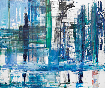
This gentleness however comes from strength. For example, the 2002 painting My City is a rigorous painting. This roughly six-and-a-half by five-and-a-half foot painting at first reads as a wheat-colored field upon which a rough grid of forest green and terra cotta has been overlaid. The long bold strokes of this grid are thick and consistent, and they trod over the rough underpainting never running out of fuel. But just like a city, we see that the grid is not an overlay, it is the structure in which one must make their way. Within each vaguely rectangular segment of the grid, the pale golden wheat color is painted in and even then, the occasional line of the grid crosses over it. I think this is the story of many a person here in New York; we try to fill in the grid with our selves and even then, when we feel we have made our mark, the city comes and erases it. When you look even closer, you find that the narrative I just described is all atop another underpainting. The bright yellow, the fiery red, the electric blue that one might naturally associate with ‘the city’ is bubbling underneath the comforting colors of the surface, as if Louise is telling us, the city is only ours when we make peace with it.
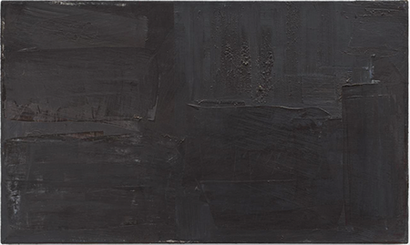
Night Of Watching #2, 1988. Oil on linen, 19 x 32 inches. © Louise Fishman. Photography:
Alex Yudzon, Cheim & Read, New York.
This sort of imaginative contemplation of a painting is probably quite out of fashion, and as I write this, I fear it is the kind of reading of a painting one dare not do aloud. However, I feel like it is a very useful tool when looking at Louise Fishman’s work. She is usually not the kind of artist who hits you over the head with a directive: look at this, think this, do that. Rather she is opening herself up to the viewer and it is our job to accept her invitation to do some thinking or feeling. For example, in Night of Watching #2, we are given a field composed of layers of nearly black vertical and horizontal marks. Specks of a medium gray appear bright against the dark grays that vary as they turn more reddish purple here, or more cool and earthy there. Some marks appear like brutalist architecture, others like distant hills. The upper left quadrant of the painting contains vertical translucent streaks that begin to pale and surround a gesture where the surface is suddenly gritty. Around the time this painting was made, Louise was adding ashes that she had collected on a visit to Auschwitz to some of her paintings. If you know this, you wonder if those ashes are what this mark is. Whether it is or is not, you are struck with a gravitas of what the moment of that visit must have felt like, of what it was to bring those ashes and memorialize them, of even this moment today 35 years later when antisemitism is again so present.
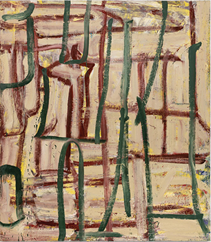
A very different mood is struck in a large canvas (72 x 88 inches) from 2016, Credo. This joyful painting is an energetic collection of large bold strokes of mostly blues and greens. The composition is almost musical, the bottom quarter is a heavy horizontal bass line above which we have first, on the left, a bold square blast of a complex chord followed on the right by a sudden strident striated flourish. Then there is a counter melody. Just above the bass line, about a third of the way into the picture, a vertical streak starts to just turn pink. Then, in the bottom right corner, almost a composition within itself, a more saturated structure of pink and white along with the aforementioned blues and greens appears to hold up the entire composition. And then, a rest.
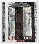
Though I was quite enraptured with Credo on one visit to the show, a smaller painting from 1979, Mine and Yours, struck me as I was leaving. The painting is quite different from Credo. It is boxy and architectural and almost appears to be the view from within a room, looking out onto a terrace with an ornate railing. This idea of looking through a doorway was so strange as I had never thought of Louise’s paintings being so representational. I assumed that this was something that only I was seeing, something that was not there. Then I thought that this painting was almost like the seed of Credo—that everything in Credo was already here nearly 40 years earlier and the artist was on a sort of spiritual journey from this painting to her Credo. Then I thought of this: One day in 2016, when I was in a particular moment of crisis, I ran into Louise on the street, near her home in Chelsea. She clearly saw I was in distress and asked what was happening and I told her. She hugged me and told me that a door was opening for me. She was profoundly accurate in that assessment. And that same profundity and generosity is in her work, for our taking.
Paul Moreno is an artist, designer, and writer working in Brooklyn, New York. He is a founder and organizer of the New York Queer Zine Fair. His work can be found on Instagram @bathedinafterthought. He is the New York City editor of the New Art Examiner.
My City, 2002. Oil on linen, 80 x 70 inches. © Louise Fishman. Photography: Alex Yudzon, Cheim & Read, New York.
Credo, 2015. Oil on linen, 72 x 88 inches. © Louise Fishman. Photography: Alex Yudzon, Cheim & Read, New York.
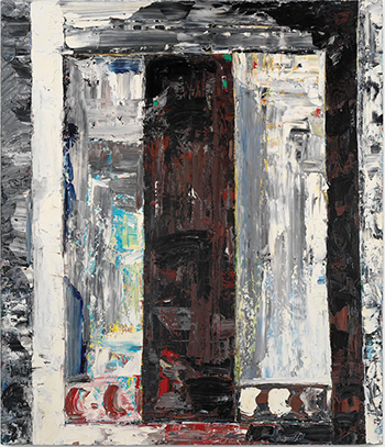
Mine and Yours, 1979. Oil on linen, 42 x 36 inches. © Louise Fishman. Photography: Alex Yudzon, Cheim & Read, New York.