
This year, we have dispatched two critics to review EXPO CHCAGO. Michel Ségard, our editor in chief, examined two trends that he found particularly noteworthy. Evan Carter, our assistant editor, took a broader look and comments on the economic and art political issues that drive the fair.
Color and Sculpture Takes the Stage
A Look at CHICAGO EXPO 2023
by Michel Ségard
This year’s CHICAGO EXPO stood out in two major ways from past years. It was the most colorful fair in recent years, and it contained an unusually large number of small-scale sculptures. In addition, it was attended by the most diverse audience I have been going to this fair (and its predecessors) for more than 35 years. This phenomenon has corresponded to the increase in recent years of Black artists’ works from around the world on display and works of art whose subject matter resonates with the African American community. The diversity of this year’s fair is a welcome evolution.
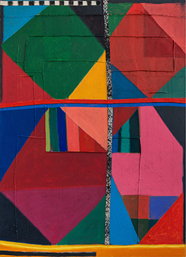
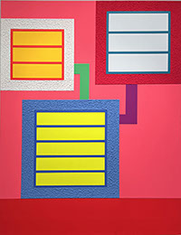
Starting with the astonishing prevalence of brightly colored paintings: there were always a number of paintings at the fair that advertised their presence with bright, saturated colors. But this year, color seems to have become a trend. Several galleries showed works that were dominated by primary colors. It seemed that Renoir’s maxim to be a successful artist, one must learn to paint a pretty picture is being followed by 21st century artists in an attempt to garner more of the market. These works also have their roots in the Fauve movement of the early 20th century and, especially, the work of Mattise. Then, this approach to color was considered vulgar and unsophisticated, hence the name Fauve, French for wild ones. Navot Miller’s Nadav and Alex in Zipolite, presented by Braverman Gallery from Tel Aviv is a prime example of this trend in the 21st century. The piece not only uses saturated blues, greens, and oranges, but it pays homage to David Hockney’s swimming pool paintings. But in Miller’s painting, the figures are older with middle-age spreads and graying hair—a nod to life’s reality.
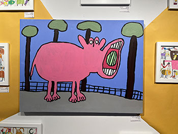 Alex Scott, Hippo Eating a Watemelon, 2019. Acrylic on canvas, 30 x 40 inches. Arts of Life/Circle Contemporary, Chicago.
My favorite painting of the entire fair is in the bright color category. It is Alex Scott’s Hippo Eating a Watemelon, presented by Arts of Life/Circle Contemporary, a workshop and gallery devoted to artists of intellectual and physical disabilities. The child-like execution and humor of the piece is irresistibly endearing. Its display on a bright yellow wall adds to the feeling of well-being. My second favorite in the bright color category are three paintings by Hugh Byrne. These three large pieces, Cast Around, Shakedown, and Turn Up the Heat make a striking trio. They show how a talented colorist can combine many saturated colors and make them work.
Hugh Byrne (from left), Cast Around, Shakedown, and Turn Up the Heat. Each: acrylic and pigment on sewn canvas, 71 x 51 inches. Ebony Curated, Cape Town.
Saturated color treatment is not new. Peter Halley has made a career of it. He even uses fluorescent acrylic paint in his works. Starting in the mid 1980s, Halley has produced a nearly homogeneous body of work consisting of orthogonally place rectangles of varying colors connected with thick, straight lines. Rosenbaum Contemporary showed his piece, Beyond the Edge.
On the international front, Alia Ali (Arabic: عاليه علي ) is a Yemeni-Bosnian-US multi-media artist. Her work was presented by Foto Relevance, a version of Pomm from 2022 being the featured work of their booth. Her pieces are pigment prints on photo Rag 310gsm with UV laminate mounted on aluminum dibond in wooden frames that have been upholstered in silk velvet. In her work, we see how bright colors are traditional to some cultures. In contrast, Yowshien Kuo’s Channel Surfing uses his bright, garish colors to critique our American culture.
(Left) Alia Ali, Pomm, 2022. Pigment print on photo Rag 310gsm with UV laminate mounted on aluminum dibond in wooden frame upholstered in silk velvet, 57 x 45 x 3 inches. Foto Relevance, Houston. (Right) Yowshien Kuo, Channel Surfing, 2023. Acrylic, bone ash, glitter, plastic, and synthetic fibers on aluminum, 72 x 72 inches. Luce Gallery, Turin,
Bright coloration is also a major factor in the politics of the LGBTQ+ community. Tandem Press used a piece by Derrick Adams as the background to their booth. The piece, Eye Candy, is a row of six images of a Black male modeling basic underwear and rendered in the six colors of the Pride flag. Adams also designed the swirling, multicolored custom wallpaper background wall on which they hang. It was one of the most visually dramatic pieces in the fair.
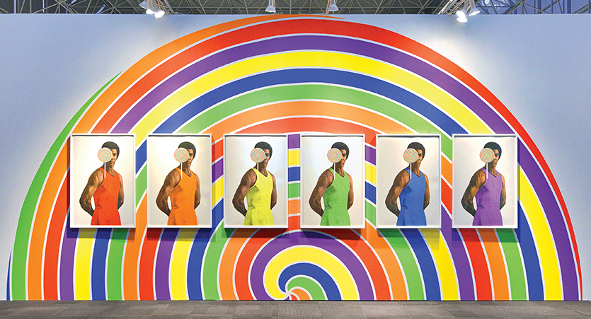
Derrick Adams, Eye Candy, 2023. Six-panel screen print with relief and collage on Coventry Rag and Arches 88 with licensing for custom wallpaper, edition of 24. Each panel is 45 x 30 inches unframed, overall installation dimensions 12 x 24 feet. Tandem Press, Madison, WI.
The other phenomenon that stood out in this year’s fair was the large number of modestly sized sculptures. There have always been a few three-dimensional pieces available, but in the early years of the fair, the emphasis was on large-scale sculpture, installed outside along the end of Navy Pier and in the parkland at the entrance to the Pier. This year, the emphasis was on sculptural pieces for interiors. This suggests an economic motive; smaller sculptures tend to cost less and are easier to place and, therefore, more marketable. There was quite a variety of sculptural styles and ranging in size and medium.
A rather large-scale piece for an interior was a sculpture by Diane Simpson, Apron X, at the Corbett vs. Dempsey booth. Simpson’s shapes are often based on items of clothing. This work is based on the shape of an apron. Simpson, a Chicago area native, had an entire room devoted to her sculpture in the 2019 Whitney Biennial. Continuing with famous names, Deborah Butterfield had one of her ubiquitous horses, albeit a very small one, at the Vallarino Fine Art booth. More interesting was Jesse Krimes’s Of Beauty and Decay; or, not (yellow) at the Malin Gallery booth. This multi-media piece of modest size, part animal, part plant, in spite of its serious title, has a playful tone that, again, provoked a smile like the reaction to the painting Hippo Eating a Watermelon by Alex Scott discussed earlier.
%20rgb.jpg?crc=4046491553)
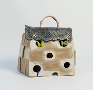
(Left) Jesse Krimes, Of Beauty and Decay; or, not (yellow), 2018. Glass, steel, tree root, artificial plant, transparency film, digital print, acrylic, 36 x 21 x 60 inches. Malin Gallery. (Right) Alejandra Seeber, House Purse, 2019. Ceramic, 12 x 9 x 15 inches. Barro/New York, Buenos Aires.
Ceramic pieces were a notable segment of this category. The ceramic sculpture Venus of Earth by Malcolm Mobutu Smith was an intriguing piece presented by the Wexler Gallery. The front of the work is the image of a woman rendered in white glaze with black accents and surrounded by a gold, irregularly shaped “halo.” But the back, seen from certain angles, suggests the form of an almost buddha-shaped, seated body. In a more whimsical tone, Alejandra Seeber had a ceramic piece called House Purse. Barro of New York and Buenos Aires devoted their entire booth to her work which included seven paintings and two ceramic sculptures.
Malcolm Mobutu Smith (front and back), Venus of Earth, 2023. Stoneware, slip, glaze, 19 x 14 x 17 inches. Wexler Gallery.
Sculptures by nonwhite artists demonstrated distinction in materials and theme. Two that stood out to this writer were Reginald Madison’s wooden wall hanging of a ceremonial head that recalled pieces in the Art Institute of Chicago’s recent exhibition “The Language of Beauty in African Art.” Equally noteworthy was Shaqui Reed’s For the Culture: Product Jacket, a clear plastic “raincoat” encrusted with pockets that contained beads, combs, hair clips, buttons, colored rubberbands, scrunchies, and hair extensions, among other things. Its play with the tools of Black women’s hair care, again, brought a smile as it reminded us that our social differences can be approached in a good-natured way. The piece was in the booth of the Museum of Science and Industry’s Black Creativity program.
Reginald Madison, Facelift, 2013. Oil on salvaged wood, 37 x 31 x
11.5 inches. Photo: September Gallery, Kinderhook, NY..
All in all, this year’s fair was more inclusive and diverse than those in past years. It made for a broader awareness of how the art world is evolving and a more interesting visit.
More is less…again.
by Evan Carter
In the way that art is a kind of mirror that reflects and reveals our humanity, the art fair is a kind of mirror that reflects the state-of-the-art world. This state, post covid, seems to be confused. Perhaps this was the case before covid but EXPO Chicago prior to 2020 seemed to revel in this confusion more than it was beaten down by it.
One particular quality of Chicago’s art scene is the desire to both engage with the high value art market while also wanting to elevate artists and artwork that dares to rebel against it. Chicago has a long history of social activism and the promotion of workers’ rights, so it is no wonder that an art fair which is typically designed to generate profits for galleries and investments for buyers would, at least, present itself as trying to have it both ways. However, in a culture gradually dragging itself out of the political and social doldrums that have been the past 4-7 years, EXPO Chicago 2023 edition shows us just how much the social and political drives of contemporary art are being strained through the filter of big capital.
This is not new. We have observed in our past reviews of art EXPO that the event has leaned heavily toward the money side of things. This was evident this year in the omission of installation and performance art on the upper level of the expo center now replaced by an excess of artworks packed into crates and gallery attendants sitting at folding tables waiting patiently to show buyers their catalogs. Spaces for performance and interactive work were once again limited but in one case expanded. Jennifer Wen Ma’s Turn of the Tide was a performance within an installation staged in the garage underneath the EXPO center. This somewhat traditional work of paper sculpture and modern interpretive dance seemed to be a mediation on ephemera and a lamentation of the earth’s climate. The text presented at the site of the piece fails to mention the presence of an actual human being interacting with the work, tearing paper from the illustrative waves, and mourning them as though they were living creatures dying from pollution. Instead, the text describes the sculptural portion as “designed to deteriorate over the duration of the art fair.” This assessment is rife with cognitive dissonance, given the fact that this installation is quite large, occupying a space that could fit one of the many restaurants on Navy pier. Since the art fair only runs for barely four days it seems that the stated goal of the work was itself performative and not put fully into practice. There is also a sad irony to the fact that this artwork about climate change is literally beneath an event that not only requires the consumption and disposal of vast amounts of material in the form of wood, drywall, paint, etc. but also caters to a demographic that no doubt contributes a great deal to the climate crisis through their investment in fossil fuels.
This iteration of EXPO was once again dominated by painting, the most viable art form on the market. There was however an increase in the presence of sculpture, but it was almost exclusively the kind made to fit on a countertop or small pedestal in an urban apartment. It has been some time since one could walk into the expo center at Navy Pier and see something like Jessica Stockholder’s colorful laundry baskets stacked to the high ceiling as was the case in 2014’s Once Upon a Time. The risks of scale and temporality were once par for the course in the world of modern art and its venues. These were gifts to the viewing public who simply wanted to see and be dazzled by art, leaving them with a memory of a moment in which they were invited to see and think differently about the world around them. Though that appetite for risk is gone from the organizers of this event, it does not seem to be entirely lost in the minds and hands of the artists. There was interesting and exciting work to see this year, much of which came in the form of painting. Here are some highlights.
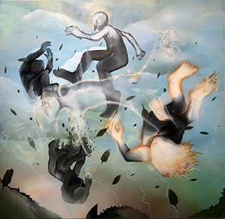
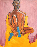
(Left) Armani Howard, Fourth Ascension (I), 2023. Acrylic on canvas. (Right) Jennifer Wen Ma, Turn of the Tide, 2023. Cut paper and pigment (size). Photos: Evan Carter.
(Above) Valerie Campos , White Tulips, 2022. Oil on linen.
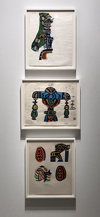
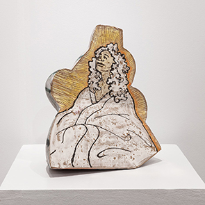
(Right) Karl Wirsum (Top), Untitled, 1974. Colored pencil and wax pencil on notebook paper. (Middle), Untitled, 1974. Wax pencil, graphite and marker on notebook paper.
(Bottom), Untitled, 1974. Red ballpoint pen, ink, colored pencil, and wax pencil on notebook paper. Photos: Evan Carter.
(Left) Sarah Dwyer, Rhino Cave, 2021. Oil and pastel on linen. (Right) Magalie Guérin, Untitled, 2021. Oil on canvas on panel. Photos: Evam Carter.
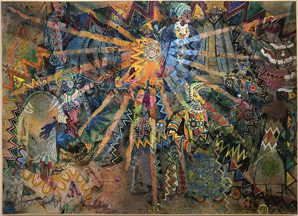
Wadsworth Jarrell, Zulu Sunday, 1980. Photo: Evan Carter.
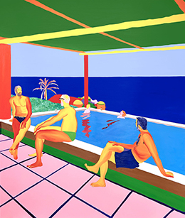
Navot Miller, Nadav and Alex in Zipolite, 2023. Oil on canvas, 78.75 x 67 inches. Braverman Gallery, Tel Aviv.
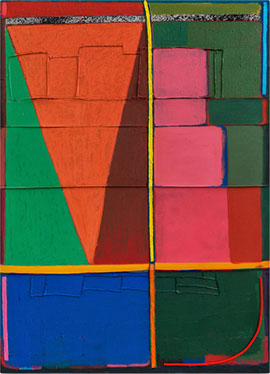
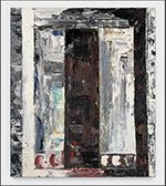
Peter Halley, Beyond the Edge, 2018. Acrylic, fluorescent acrylic and Roll-A-Tex on canvas, 77.88 x 59.12 inches. Rosenbaum Contemporary, Boca Raton/Palm Beach.
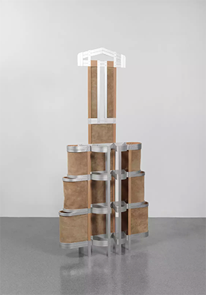
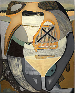
Diane Simpson, Apron X, 2005. Aluminum and leather, 75 × 36 × 8 1/2 inches. Corbett vs. Dempsey, Chicago.
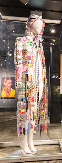
Shaqui Reed, For the Culture: Product Jacket, 2021.Vinyl, plastic hair clips, combs, barrettes, an beads. Museum of Science of Industry,Chicago, Black Creativity program.